Web View
Get the Jump app
You'll need the free Jump app to preview this page on your device. Install it, then scan the code again.
With EDGE, native UI is the primary way to build your app — the web view is just one more component you can reach for, not the foundation everything sits on. You're free to compose entire screens from native EDGE components and never render a web view at all.
That said, the web view is a first-class component, and you can lean on it as much (or as little) as you like. The web view lets you use whichever web technologies you are most comfortable with — Livewire, Vue, React, Svelte, HTMX... even jQuery! — to build part or all of your UI.
A common pattern is to embed a web view for your content-heavy or existing web UI, then sprinkle native EDGE components around it — a native Top Bar, Bottom Navigation or Bottom Sheet — to give the app a truly native feel where it matters most. If you prefer, you can still let a full-screen web view drive the whole app and call native functions and dispatch native UI from within it.
Embedding a Web View#
The <native:webview> element embeds a web view inside a native screen, like any other EDGE component. Point it at a
remote URL:
<native:column class="w-full h-full"> <native:webview src="https://example.com" class="flex-1 w-full" /></native:column>Or render an inline HTML document by placing markup in the element's slot — it's delivered to the web view verbatim, so you can hand it a complete document:
<native:webview class="flex-1 w-full"> <!doctype html> <html> <head> <meta name="viewport" content="width=device-width, initial-scale=1"> </head> <body> <h1>Hello from HTML</h1> </body> </html></native:webview>A web view doesn't size itself to its content — give it bounded dimensions, either by letting it fill a flex parent
(class="flex-1 w-full") or with an explicit height.
Props#
All shared layout and style attributes are supported, plus:
src- URL to load (string)html- Inline HTML document (string). Usually provided via the slot; an explicit:htmlattribute takes precedence over slot contentjavascript(aliasjs) - Enable JavaScript (bool, default:false)dom-storage(aliasdomStorage) - Enable DOM storage —localStorage/sessionStorage(bool, default:false)php- Serve the web view from the app's own embedded Laravel runtime instead of a sandboxed foreign page (bool, default:false). See PHP modefullscreen- Fill the screen and extend behind the safe areas (bool, default:false). See Fullscreen
Events#
@navigated- Fires once per committed top-frame navigation, with the resolved URL as the first argument:
<native:webview src="https://example.com" javascript @navigated="urlChanged" class="flex-1 w-full"/>public function urlChanged(string $url): void{ $this->lastVisited = $url;}PHP mode#
The php attribute swaps the sandbox for the app's own Laravel web view — pages are served per-request by the
embedded PHP runtime, with the full window.Native bridge, your asset pipeline, and the same session as the rest of
the app (an embedded page can read and write the session your native screens use).
In this mode src is an app route path rather than a URL; anything not starting with / (including omitting it)
falls back to the app's configured start URL:
<native:webview php src="/dashboard" class="flex-1 w-full" />The sandbox opt-ins don't apply here — an enriched web view needs JavaScript and DOM storage, so the renderers force both on.
Each php-mode web view runs on its own dedicated PHP context with its own thread, booted when the web view enters the view hierarchy and torn down when it leaves. This keeps the native screen's event loop free to keep serving the screen (the two never contend), and reclaims the context's resources the moment the web view unmounts. The first load pays the context boot; requests after that are served warm.
Fullscreen#
The fullscreen attribute reproduces the classic v3 default-webview presentation: the element takes all available
space and the renderers extend it behind the safe areas, edge to edge:
<native:webview src="{{ $url }}" javascript fullscreen @navigated="onUrlChanged"/>For a true takeover, render the web view as the screen's only content — any native siblings still occupy their own space first. Native chrome (a stack layout's top bar) remains above it, giving the user a way back.
Element#
use Native\Mobile\UI\Elements\Webview; Webview::make('https://example.com') ->onNavigated('urlChanged');make(string $src = '')- Create a web view pointed at a URLphp(bool $value = true)- Enriched mode — serve from the app's own runtime (PHP mode)fullscreen(bool $value = true)- Fill the screen and extend behind the safe areas (Fullscreen)onNavigated(string $method)- Component method to call on each committed top-frame navigationapplyAttributes(array $attrs)- Apply any of the attributes above (e.g.['html' => $doc, 'javascript' => true])
Full-Screen Web Views#
When you do use a full-screen web view, it's rendered to fill the view of your application and remains visible to your users until another full-screen action takes place, such as accessing the camera or an in-app browser. The rest of this page covers how to make that surface behave well on device.
The Viewport#
Just like a normal browser, the web view has the concept of a viewport which represents the viewable area of the
page. The viewport can be controlled with the viewport meta tag, just as you would in a traditional web application:
<meta name="viewport" content="width=device-width, initial-scale=1">Disable Zoom#
When building mobile apps, you may want to have a little more control over the experience. For example, you may want to disable user-controlled zoom, allowing your app to behave similarly to a traditional native app.
To achieve this, you can set user-scalable=no:
<meta name="viewport" content="width=device-width, initial-scale=1, user-scalable=no">Edge-to-Edge#
To give you the most flexibility in how you design your app's UI, the web view occupies the entire screen, allowing you to render anything anywhere on the display whilst your app is in the foreground using just HTML, CSS and JavaScript.
But you should bear in mind that not all parts of the display are visible to the user. Many devices have camera
notches, rounded corners and curved displays. These areas may still be considered part of the viewport, but they may
be invisible and/or non-interactive.
To account for this in your UI, you should set the viewport-fit=cover option in your viewport meta tag and use the
safe area insets.
Safe Areas#
Safe areas are the sections of the display which are not obscured by either a physical interruption (a rounded corner or camera), or some persistent UI, such as the Home Indicator (a.k.a. the bottom bar) or notch.
Safe areas are calculated for your app by the device at runtime and adjust according to its orientation, allowing your UI to be responsive to the various device configurations with a simple and predictable set of CSS rules.
The fundamental building blocks are a set of four values known as insets. These are injected into your pages as the
following CSS variables:
--inset-top--inset-bottom--inset-left--inset-right
You can apply these insets in whichever way you need to build a usable interface.
There is also a handy nativephp-safe-area CSS class that can be applied to most elements to ensure they sit within
the safe areas of the display.
Say you want a fixed-position header bar like this:
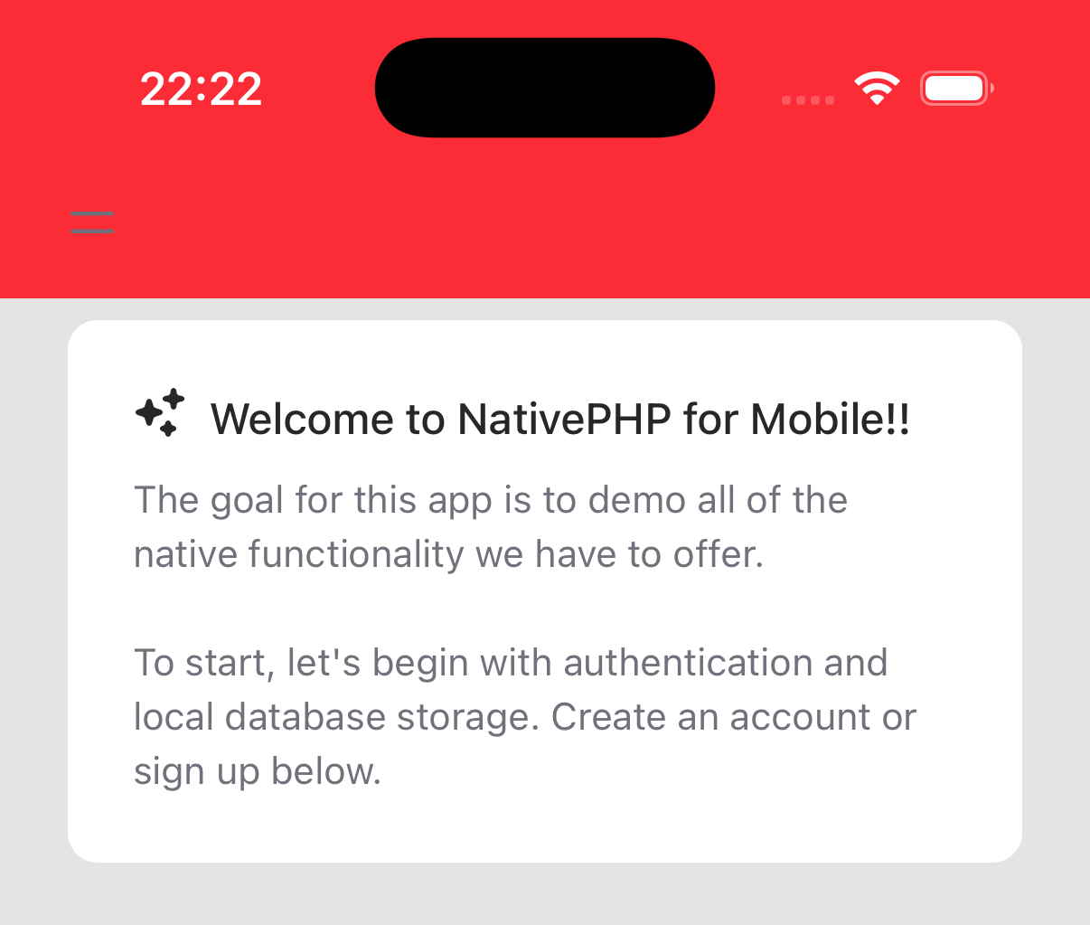
If you're using Tailwind, you might try something like this:
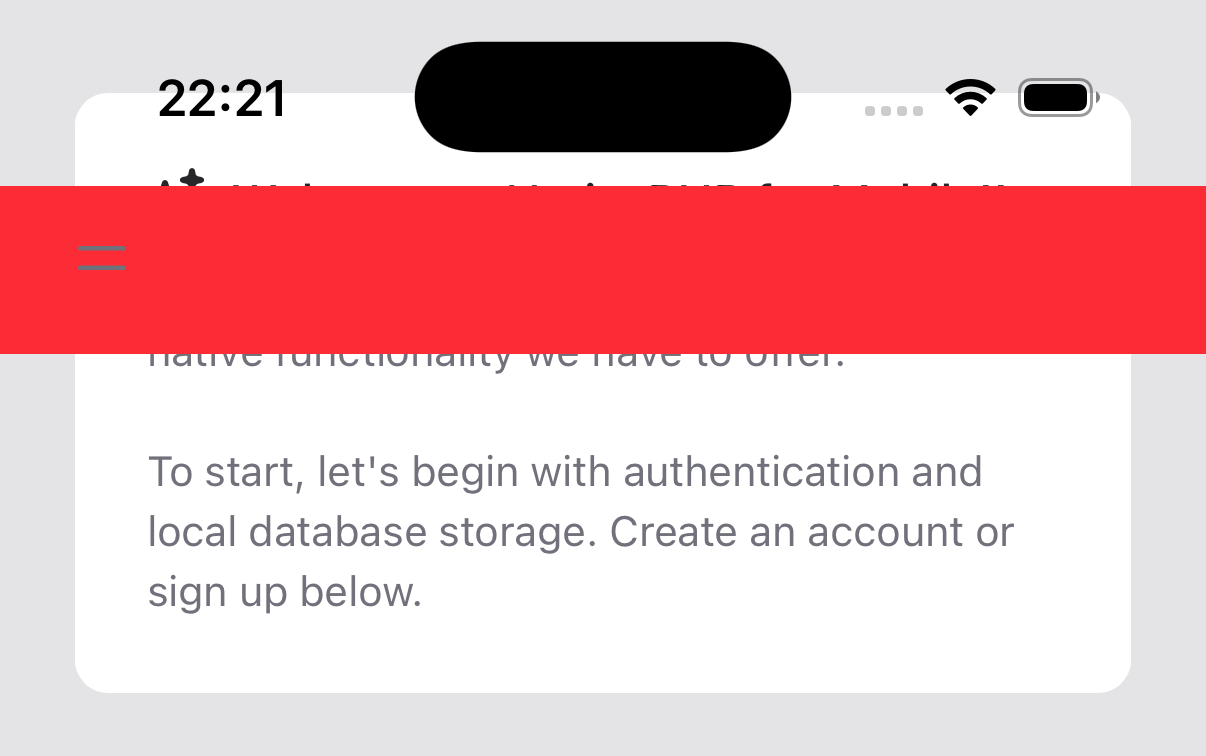
<div class="fixed top-0 left-0 w-full bg-red-500"> ...</div>If you tried to do this without viewport-fit=cover and use of the safe areas, here's what you'd end up with in
portrait view:
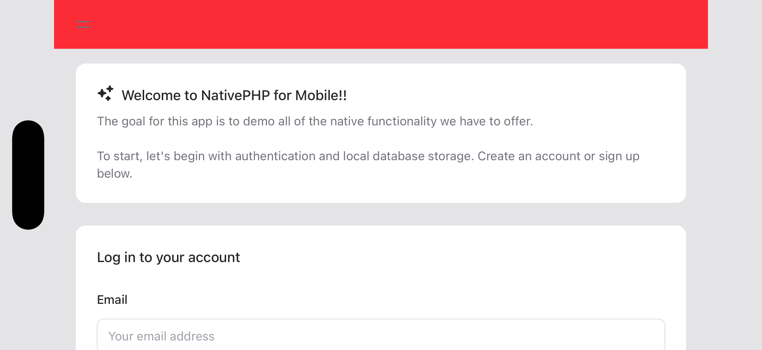
And it may be even worse in landscape view:
But by adding a few simple adjustments to our page, we can make it beautiful again (Well, maybe we should lose the red...):
<body class="nativephp-safe-area"><div class="fixed top-0 left-0 w-full bg-red-500 pl-[var(--inset-left)] pr-[var(--inset-right)]"> ...</div>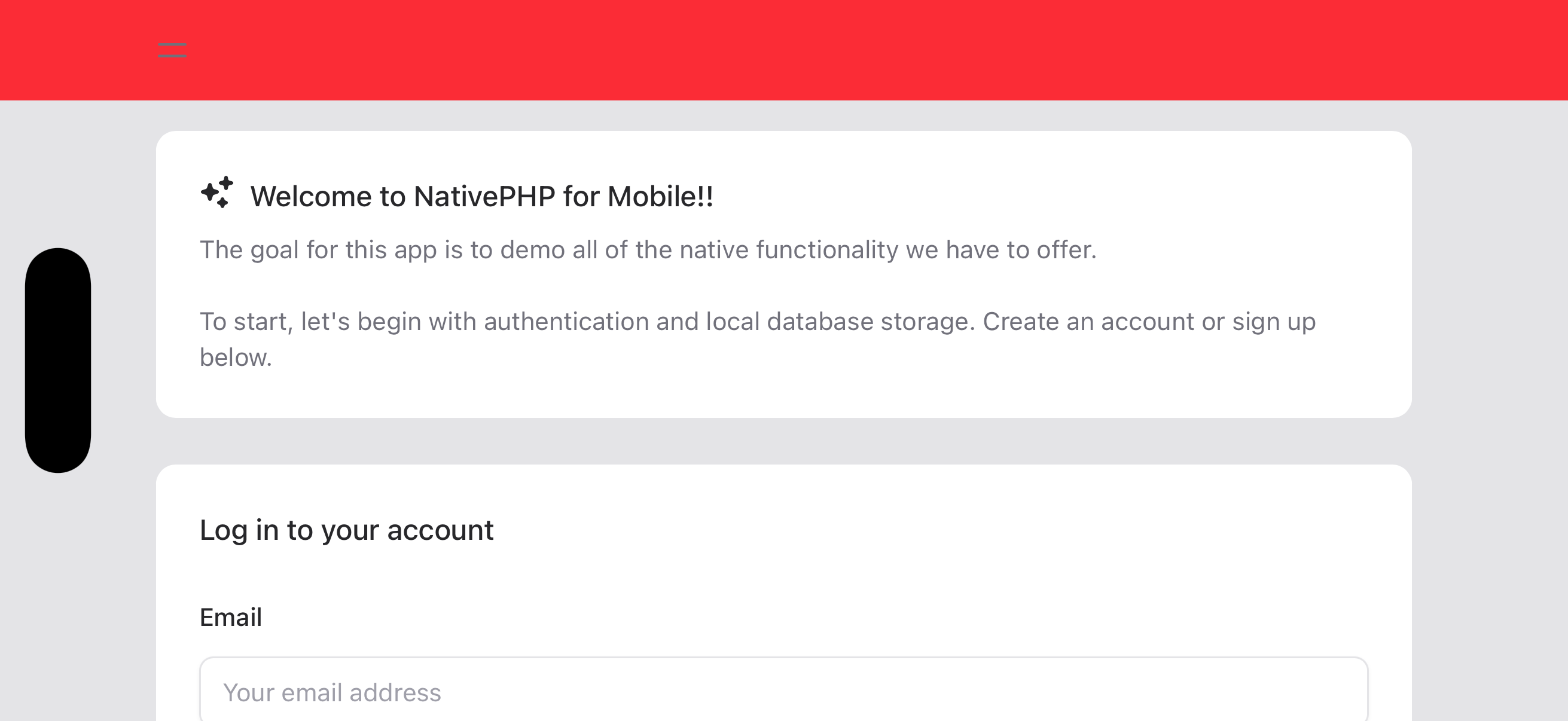
Status Bar Style#
On Android, the icons in the Status Bar do not change color automatically based on the background color in your app. By default, they change based on whether the device is in Light/Dark Mode.
If you have a consistent background color in both light and dark mode, you may use the nativephp.status_bar_style
config key to set the appropriate status bar style for your app to give users the best experience.
The possible options are:
auto- the default, which changes based on the device's Dark Mode settinglight- ideal if your app's background is dark-coloreddark- better if your app's background is light-colored
Keyboard Visibility#
When the on-screen keyboard appears, it can cover inputs, action buttons or other parts of your UI that the user needs
to see or interact with. To help you adapt your layout, NativePHP automatically toggles a keyboard-visible class on
the <body> element whenever the software keyboard opens or closes — on both iOS and Android.
You can use this class to hide, move or resize elements while the keyboard is up, using CSS alone:
/* Hide a fixed bottom navigation bar while the user is typing */.bottom-nav { transition: transform 0.2s ease-out;} body.keyboard-visible .bottom-nav { transform: translateY(100%);}If you're using Tailwind, you can register a keyboard-visible variant in your CSS file using the @custom-variant
directive:
@import "tailwindcss"; @custom-variant keyboard-visible (&:where(body.keyboard-visible *));You can then use it like any built-in variant:
<nav class="fixed bottom-0 left-0 w-full transition-transform keyboard-visible:translate-y-full"> ...</nav>This pairs well with the Safe Areas insets, allowing you to build layouts that respond cleanly to both device geometry and keyboard state without writing any JavaScript.
WebView Compatibility#
On Android, the web view is powered by the system's built-in WebView component, which varies by device and OS version. Older Android versions ship with older WebView engines that may not support modern CSS features.
For example, Tailwind CSS v4 uses @theme and other newer CSS features that are not supported on older WebView
versions. If you are targeting a lower min_sdk to support older devices, consider using Tailwind CSS v3 or another
CSS framework that generates compatible output. You can configure your minimum SDK version in your
Android SDK Versions settings.
Always test your app on emulators running your minimum supported Android version to catch these issues early. You can create emulators for older API levels in Android Studio's Virtual Device Manager.
With just a few small changes, we've been able to define a layout that will work well on a multitude of devices without having to add complex calculations or lots of device-specific CSS rules to our code.

in no time







