Top Bar
Get the Jump app
You'll need the free Jump app to preview this page on your device. Install it, then scan the code again.
Overview#
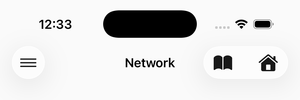
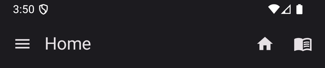
A top bar with title, subtitle, and action buttons. Placing <native:top-bar> at the root of a screen's Blade is a
first-class way to give that screen its own bar — the element hoists onto the real native chrome root (a
NavigationStack on iOS, a Scaffold toolbar on Android), so you get edge-swipe back, predictive back, large
titles, and Liquid Glass / Material You for free. It renders identically to the NavBar builder
a layout produces — inline is the tool when the bar belongs to one screen; a layout is the
tool when many screens share it.
<native:top-bar title="Dashboard" subtitle="Welcome back"> <native:top-bar-action id="search" label="Search" icon="search" @tap="openSearch" /> <native:top-bar-action id="settings" icon="settings" label="Settings" url="https://yourapp.com/my-account" /></native:top-bar>The override contract#
An inline top bar wins over the layout's top bar for that slot — the layout's tab bar (the other slot) still renders. This lets a single screen customize its title bar without dropping its layout. An inline bar on a screen with no layout at all still produces native chrome. See Inline overrides.
Every attribute is a Blade expression evaluated against your screen's state, so the bar is reactive: bind a subtitle, swap an action icon, or flip a title and it re-renders when the underlying property changes.
@php $unread = 3; @endphp <native:top-bar :title="$unread ? 'Inbox' : 'All caught up'" :subtitle="$unread.' unread'" />Props#
title- The title text (optional, string)subtitle- A small line under the title (optional, string)back- Show the back chevron (optional, boolean). Alias ofshow-navigation-iconshow-navigation-icon- Show the back chevron (optional, boolean)background-color- Bar background color. Hex string (optional)text-color- Title and icon color. Also the default tint for<native:top-bar-action>icons (optional)font-name- Custom font for the title/subtitle: aresources/fonts/token or config alias (optional)display-mode- Title display mode:inline,large, orautomatic(optional, default:inline)scroll-behavior- How the bar reacts to content scrolling:collapse,pinned, orenterAlways(optional)elevation- Hairline thickness at the bottom of the bar in dp (optional, int)search-placeholder- Placeholder for an attached native search field (optional). See Searchsearch-on-query- Screen method invoked as the search text changes (optional)search-debounce-ms- Debounce forsearch-on-queryin milliseconds (optional, default:300)custom- Keep the bar in the content tree as an ordinary drawn element instead of hoisting it (optional, boolean). See Custom bars
Children#
A <native:top-bar> can contain up to 10 <native:top-bar-action> elements, displayed on the trailing edge.
On Android, the first 3 actions are shown as icon buttons; additional actions collapse into an overflow menu (⋮). On iOS, if more than 5 actions are provided, they collapse into an overflow menu.
<native:top-bar-action> Props#
id- Unique identifier (required)icon- A named icon — the cross-platform fallback (optional if a platform icon is given)ios-icon/android-icon- Per-platform icon overrides: an enum case (App\Icons\Ios,App\Icons\Android,App\Icons\AndroidOutlined) or a raw symbol string.ios/androidare accepted as shorthand (optional). See Platform iconsmaterial-variant- Material style hint for Android, e.g.outlined(optional). Set automatically when you use anAndroidOutlinedenum caselabel- Text label. Used for accessibility and displayed in overflow menus (optional but recommended)url- A URL to navigate to when tapped (optional)destructive- Render in the destructive (red) tint (optional, boolean)
Platform icons#
<native:top-bar-action> resolves icons through the same contract as <native:icon>: a
shared icon string is the cross-platform fallback, and :ios-icon / :android-icon (or the :ios / :android
shorthand) override it per platform. Each override accepts a generated enum case or a raw symbol string; an
AndroidOutlined case carries its material_variant automatically.
@use('App\Icons\Ios')@use('App\Icons\AndroidOutlined') <native:top-bar title="Library"> <native:top-bar-action id="favorite" label="Favorite" :ios="Ios::StarFill" :android="AndroidOutlined::Star" @tap="toggleFavorite" /></native:top-bar>On iOS the SF Symbol wins and no Material variant is emitted; on Android the Material glyph (plus any outlined
variant) wins; when the platform can't be determined the shared icon string is used verbatim.
Custom bars#
Add the boolean custom attribute to keep a bar in the content tree as an ordinary drawn element — the escape hatch
for a design the system bar can't express. It is not hoisted onto the native chrome root, but it still
suppresses the layout's top bar for that slot, so you never get two bars.
<native:top-bar custom background-color="#0891b2"> {{-- Draw whatever you like; this bar renders inline, not as native chrome --}}</native:top-bar>Builder alternative#
When many screens share the same bar, declare it once with the NavBar builder in a layout
instead of repeating the inline element. The builder produces the exact same native chrome — see the
Builder reference for NavBar, NavAction, and NavBarOptions.
Per-screen overrides#
A screen wrapped by a layout can override the title, colors, display behavior, and add actions on top of what its
layout supplies by overriding navigationOptions() — without writing an inline bar:
use Native\Mobile\Edge\Layouts\Builders\NavAction;use Native\Mobile\Edge\Layouts\Builders\NavBarOptions;use Native\Mobile\Edge\NativeComponent; class ItemDetail extends NativeComponent{ public function navigationOptions(): ?NavBarOptions { return NavBarOptions::make() ->title("Item #{$this->param('id')}") ->action(NavAction::make('save')->icon('save')->press('save')); } public function save(): void { // ... }}Non-null fields override the layout's NavBar; null fields fall through. action() appends to whatever the layout
already declared. See the NavBarOptions reference in Layouts.
Hiding the nav bar on a screen#
Individual screens can opt out of their layout's nav bar entirely — the full-bleed pattern for photo viewers, onboarding flows, and video screens:
class PhotoViewer extends NativeComponent{ protected bool $hidesNavBar = true;}This is equivalent to returning NavBarOptions::make()->hidden() from navigationOptions(); if both are set, the
explicit builder wins. It's the top-bar parallel to the tab bar's hidden().
Navigation keeps working while the bar is hidden — pushes, pops, and @navigate all behave normally. With the bar
hidden the screen is full-bleed: on Android the content extends up to the very top edge, under the transparent
status bar; use the safe-area utilities on elements that should stay clear of the clock and status icons. On iOS
the edge-swipe-back gesture is tied to the visible bar, so a pushed screen that hides it should render its own back
control (for example a floating button that uses @navigate to return to the parent screen).
See Layouts for the full picture.

in no time







