Bottom Navigation
Get the Jump app
You'll need the free Jump app to preview this page on your device. Install it, then scan the code again.
Overview#

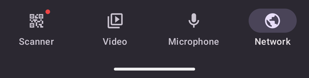
A bottom navigation bar with up to 5 items — your app's primary navigation. Placing <native:bottom-nav> at the
root of a screen's Blade hoists it onto the real native chrome root (a TabView on iOS, a NavigationBar in a
Scaffold on Android), so you get the platform tab bar with Liquid Glass / Material You for free. It renders
identically to the TabBar builder a layout produces — inline is
the tool when the tabs belong to one screen; a layout is the tool when many screens share
the same tabs.
One bar demonstrates the whole item API — an active tab, a news dot, and a badge:
<native:bottom-nav label-visibility="labeled"> <native:bottom-nav-item id="home" icon="home" label="Home" url="/home" :active="true" /> <native:bottom-nav-item id="friends" icon="person.3.fill" label="Friends" url="/friends" :news="true" /> <native:bottom-nav-item id="profile" icon="person" label="Profile" url="/profile" badge="3" /></native:bottom-nav>The override contract#
An inline bottom nav wins over the layout's tab bar for that slot — the layout's top bar (the other slot) still renders. An inline bar on a screen with no layout at all still produces native chrome. Every attribute is a Blade expression over your screen's state, so a badge count or active tab is reactive and re-renders when the underlying property changes. See Inline overrides.
Props#
label-visibility-labeled,selected, orunlabeled(optional, default:labeled)dark- Force dark mode styling (optional, boolean)active-color- Color of the active tab's icon and label. Hex string (optional)background-color- Bar background color. Hex string. Wins overdark's default (optional)text-color- Color of inactive tab icons and labels. Hex string. Active tabs useactive-color(optional)font-name- Custom font for tab labels: aresources/fonts/token or config alias (optional)minimize-on-scroll- Shrink the bar as content scrolls (optional, boolean) [iOS 26+]custom- Keep the bar in the content tree as an ordinary drawn element instead of hoisting it (optional, boolean). Still suppresses the layout's tab bar for that slot
Children#
A <native:bottom-nav> can contain up to 5 <native:bottom-nav-item> elements.
Props#
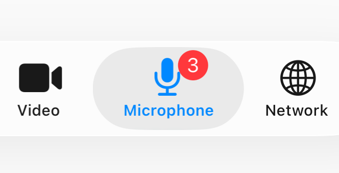
id- Unique identifier (required)icon- A named icon — the cross-platform fallback (optional if a platform icon is given)ios-icon/android-icon- Per-platform icon overrides: an enum case (App\Icons\Ios,App\Icons\Android,App\Icons\AndroidOutlined) or a raw symbol string.ios/androidare accepted as shorthand (optional). See Platform iconsmaterial-variant- Material style hint for Android, e.g.outlined(optional). Set automatically by anAndroidOutlinedenum caselabel- Accessibility / display label (required)url- A URL to navigate to when tapped (required). Tab taps replace — see belowactive- Highlight this item as active (optional, default:false). An explicitactivebeats the automatic longest-prefix URL highlightbadge- Badge text/number, e.g."2"— small red pill anchored top-right of the icon (optional)badge-color- Badge color. Hex string (optional)news- Show a small red dot anchored top-right of the icon. Mutually exclusive withbadge(optional, default:false)
Here's badge on a tab item:
Active tab highlighting#
If no item is marked active, the framework auto-highlights the tab whose url is the longest prefix of the
current screen's URI — so /friends/42 lights the /friends tab. Set :active="true" on an item to force the
highlight explicitly (a search-results screen reached from the Search tab, say); an explicit choice always wins over
the prefix match.
Platform icons#
<native:bottom-nav-item> resolves icons through the same contract as <native:icon>: a
shared icon string is the cross-platform fallback, and :ios-icon / :android-icon (or the :ios / :android
shorthand) override it per platform. Each override accepts a generated enum case or a raw symbol string; an
AndroidOutlined case carries its material_variant automatically.
@use('App\Icons\Ios')@use('App\Icons\AndroidOutlined') <native:bottom-nav> <native:bottom-nav-item id="home" label="Home" url="/home" :ios="Ios::House" :android="AndroidOutlined::Home" /></native:bottom-nav>Search tab#
Mark one item with the boolean search attribute to make it present a native search field instead of navigating.
The search corpus comes from the screen's searchItems() or onSearchQuery() methods; search-placeholder and
search-debounce-ms (default 250) tune the field. See Search for the full flow.
Builder alternative#
When many screens share the same tabs, declare them once with the TabBar builder in a
layout instead of repeating the inline element. The builder produces the exact same native
chrome — see the Builder reference for TabBar and Tab.
Per-screen tab bar#
Screens can adjust their layout's tab bar for the current screen by overriding tabBarOptions(). Non-null fields
override the layout's defaults; null fields fall through. This is the tab-bar parallel to the top bar's
navigationOptions(). Per-screen tab content edits (inserting or removing tabs) are
out of scope — define your tabs once at the layout level.
use Native\Mobile\Edge\Layouts\Builders\TabBarOptions;use Native\Mobile\Edge\NativeComponent; class ChatThread extends NativeComponent{ public function tabBarOptions(): ?TabBarOptions { return TabBarOptions::make() ->hidden() // hide the tab bar on this pushed detail screen ->highlight('chats'); // keep the "Chats" tab lit while you're inside it }}For the common "hide the tab bar on this detail screen" case, the shorter protected bool $hidesTabBar = true;
property on the screen is equivalent to TabBarOptions::make()->hidden(). Use either; if both are set, the explicit
builder wins. See the TabBarOptions reference in Layouts.

in no time







