Side Navigation
Get the Jump app
You'll need the free Jump app to preview this page on your device. Install it, then scan the code again.
Important
Use the Drawer layout. Unlike the other inline chrome elements
(top-bar, bottom-nav, fab), an inline <native:side-nav> currently has
no built-in drawer host: the element compiles and is hoisted onto the chrome root, but nothing consumes it
yet, so it renders nothing on either platform. Provide drawers with the Drawer builder in a NativeLayout —
its contents are any Blade view. The element reference below is kept for when the inline drawer host lands.
Overview#
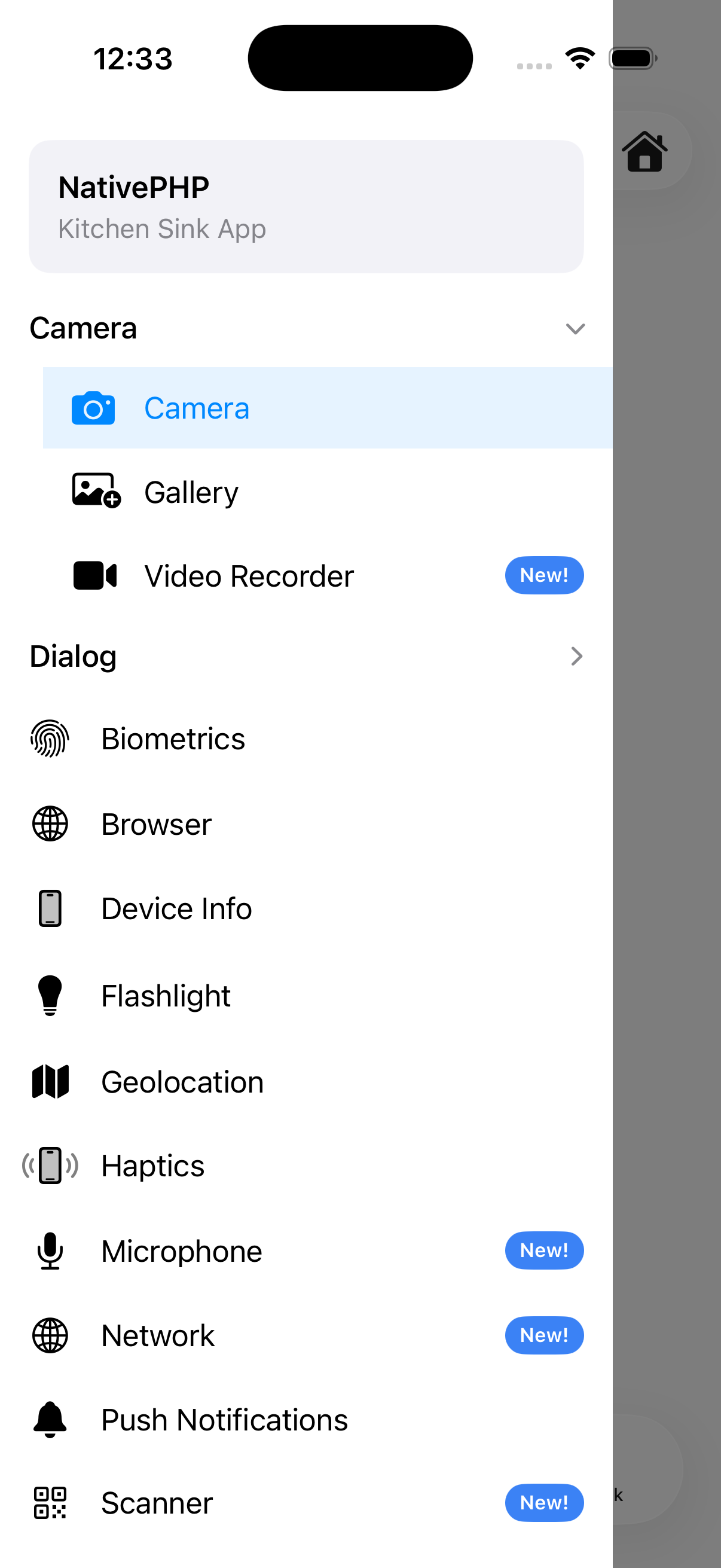
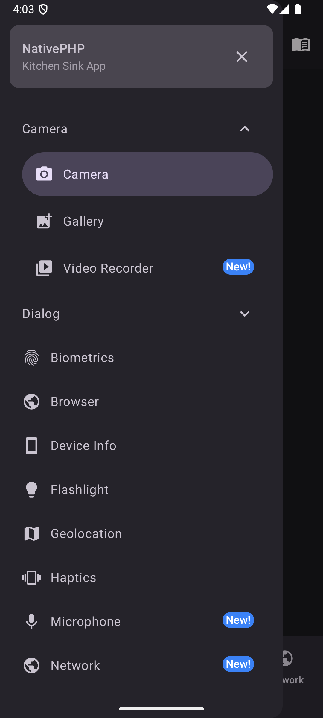
A slide-out navigation drawer with support for groups, headers, and dividers.
<native:side-nav gestures-enabled="true"> <native:side-nav-header title="My App" icon="person" /> <native:side-nav-item id="home" label="Home" icon="home" url="/home" :active="true" /> <native:side-nav-group heading="Account" :expanded="false"> <native:side-nav-item id="profile" label="Profile" icon="person" url="/profile" /> <native:side-nav-item id="settings" label="Settings" icon="settings" url="/settings" /> </native:side-nav-group> <native:horizontal-divider /> <native:side-nav-item id="help" label="Help" icon="help" url="https://help.example.com" open-in-browser="true" /></native:side-nav>Props#
gestures-enabled- Swipe to open (default:false) [Android]label-visibility-labeled(default),selected, orunlabeled(optional)dark- Force dark mode (optional, boolean)
Children#
Important
In the Layout model a drawer's contents are any Blade view — build
the header, items, and groups below with standard EDGE components inside a Drawer, rather than the
<native:side-nav-*> elements.
<native:side-nav-header>#
title- Title text (optional)subtitle- Subtitle text (optional)icon- A named icon (optional)background-color- Background color. Hex code (optional)show-close-button- Show a close × (optional, default:true) [Android]pinned- Keep header visible when scrolling (optional, default:false)
<native:side-nav-item>#
id- Unique identifier (required)label- Display text (required)icon- A named icon (required)url- A URL to navigate to in the web view (required)open-in-browser- Force theurlto open in the device's default browser instead of the web view, whatever its domain (optional, default:false)active- Highlight this item as active (optional, default:false)badge- Badge text (optional)badge-color- Hex code or named color (optional)
<native:side-nav-group>#
heading- The group's heading (required)expanded- Initially expanded (optional, default:false)icon- Material icon (optional)
<native:horizontal-divider>#
Add visual separators between navigation items. This item has no properties.

in no time







