You're viewing an older version of this documentation. View the latest version (3.x)
Top Bar
Overview#
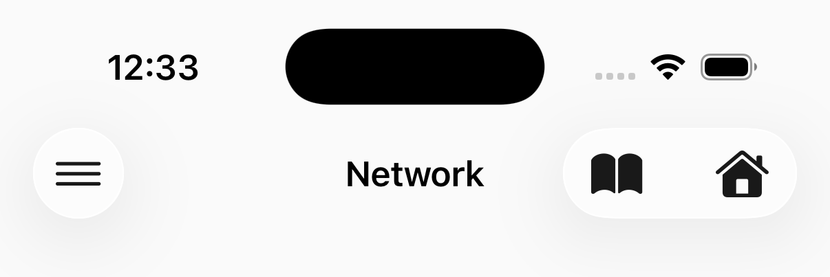
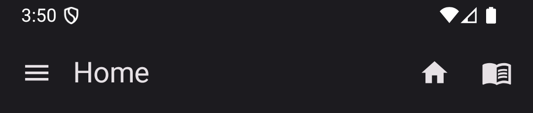
A top bar with title and action buttons. This renders at the top of the screen.
Copied!
<native:top-bar title="Dashboard" subtitle="Welcome back"> <native:top-bar-action id="search" label="Search" icon="search" :url="route('search')" /> <native:top-bar-action id="settings" icon="settings" label="Settings" url="https://yourapp.com/my-account" /></native:top-bar>Props#
title- The title text (required)show-navigation-icon- Show back/menu button (optional, default:true)label- If more than 5 actions, iOS will display an overflow menu and the labels assigned to each item (optional)background-color- Background color. Hex code (optional)text-color- Text color. Hex code (optional)elevation- Shadow depth 0-24 (optional) [Android]
Children#
A <native:top-bar> can contain up to 10 <native:top-bar-action> elements. These are displayed on the trailing edge of the bar.
Props#
id- Unique identifier (required)icon- A named icon (required)label- Accessibility label (optional)url- A URL to navigate to in the web view (optional)
On Android, the first 3 actions are shown as icon buttons; additional actions collapse into an overflow menu (⋮). On iOS, if more than 5 actions are provided, they collapse into an overflow menu.
<native:top-bar-action> Props#
id- Unique identifier (required)icon- A named icon (required)label- Text label for the action. Used for accessibility and displayed in overflow menus (optional but recommended)url- A URL to navigate to when tapped
NativePHP
Bring your
Laravel
skills to the
desktop.
Cloud Platform
Bifrost
Build your NativePHP apps
in the cloud.
Ship it!
Plans from $19/mo
Plugin Dev Kit
Build native plugins with
Claude Code
Learn More
NativePHP Ultra
All NativePHP plugins, teams & priority support from
$35/mo
Learn More
The Vibes
The unofficial Laracon US
Day 3
Grab Your Spot
Only 100 tickets!
The Masterclass
Go from zero to
published app
in no time
in no time
Learn More