You're viewing an older version of this documentation. View the latest version (3.x)
Side Navigation
Overview#
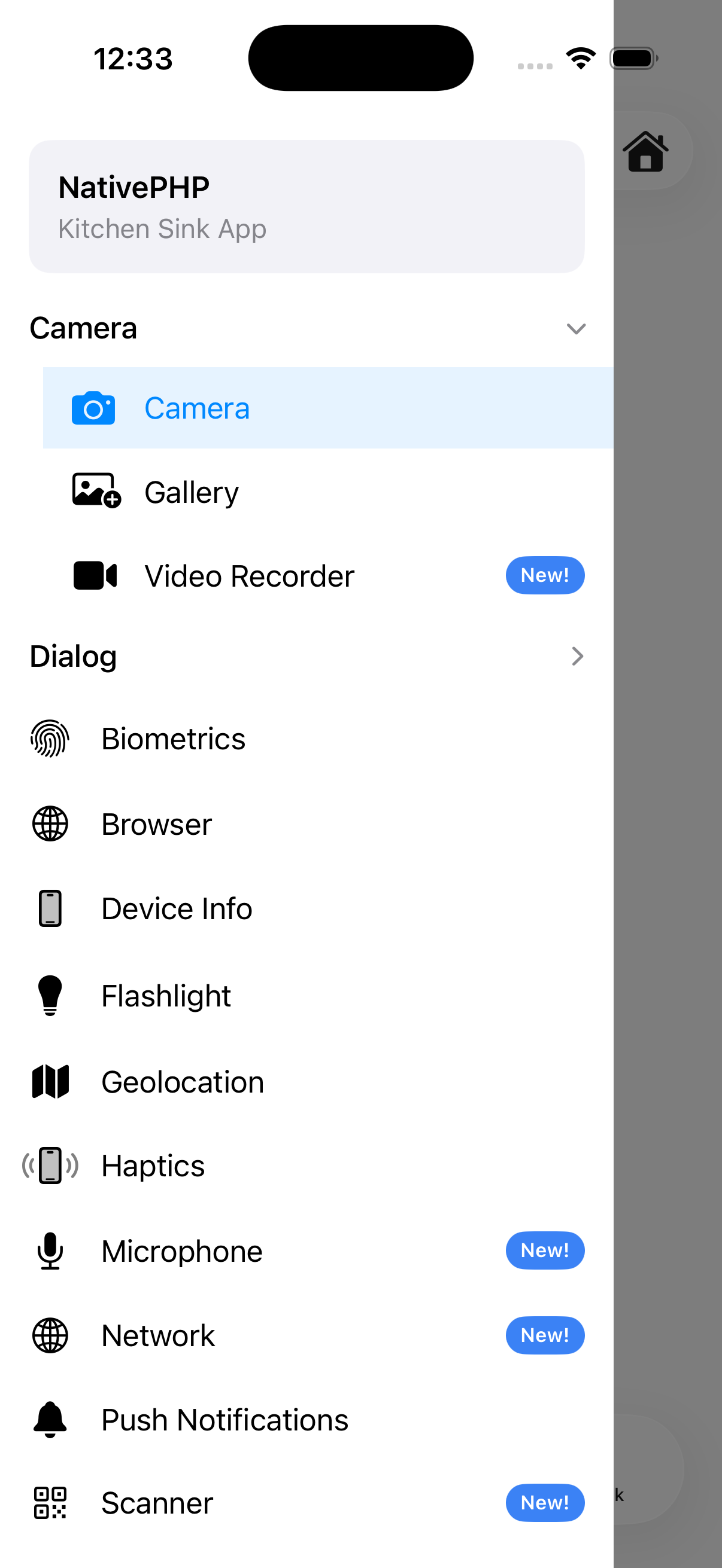
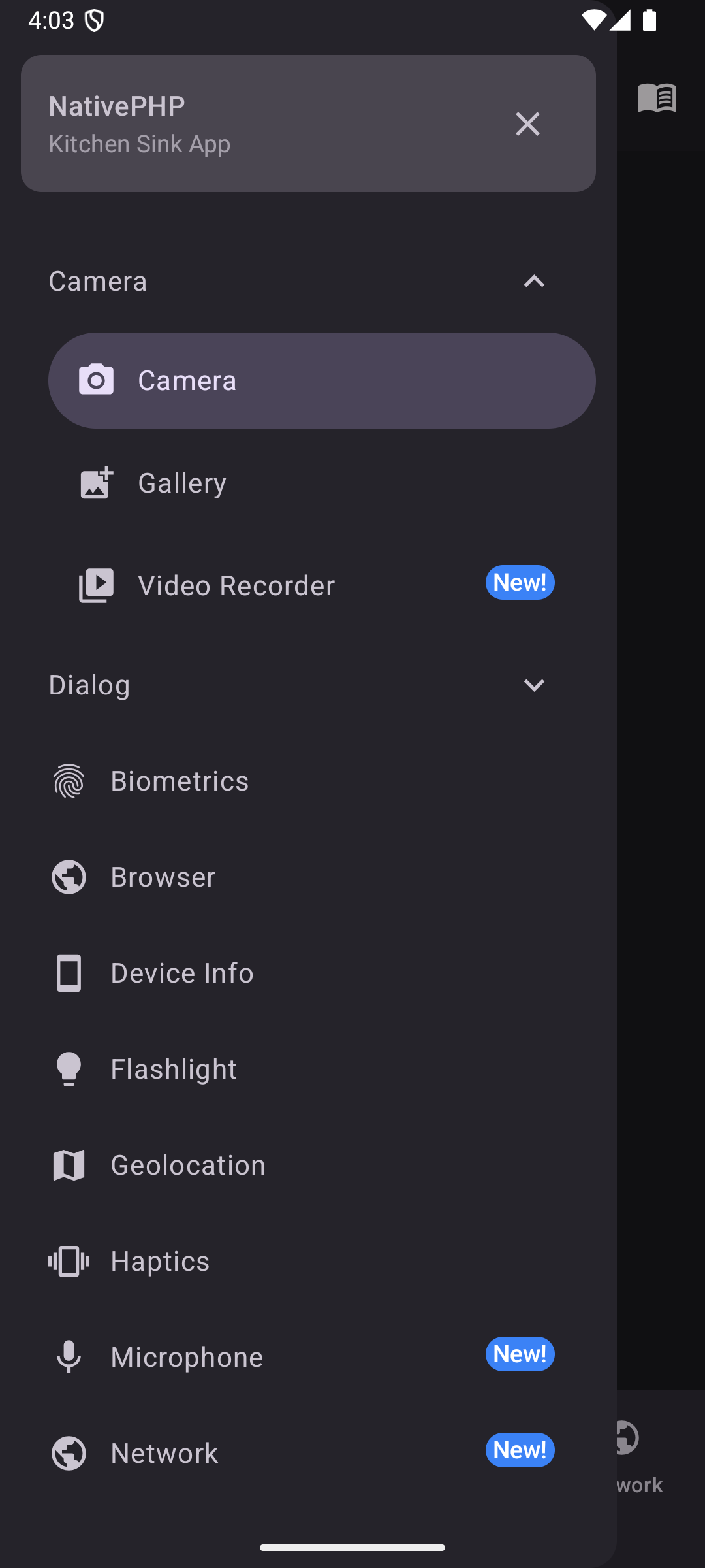
A slide-out navigation drawer with support for groups, headers, and dividers.
Copied!
<native:side-nav gestures-enabled="true"> <native:side-nav-header title="My App" icon="person" /> <native:side-nav-item id="home" label="Home" icon="home" url="/home" :active="true" /> <native:side-nav-group heading="Account" :expanded="false"> <native:side-nav-item id="profile" label="Profile" icon="person" url="/profile" /> <native:side-nav-item id="settings" label="Settings" icon="settings" url="/settings" /> </native:side-nav-group> <native:horizontal-divider /> <native:side-nav-item id="help" label="Help" icon="help" url="https://help.example.com" open-in-browser="true" /></native:side-nav>Props#
gestures-enabled- Swipe to open (default:false) [Android]dark- Force dark mode (optional)
Children#
<native:side-nav-header>#
title- Title text (optional)subtitle- Subtitle text (optional)icon- A named icon (optional)background-color- Background color. Hex code (optional)show-close-button- Show a close × (optional, default:true) [Android]pinned- Keep header visible when scrolling (optional, default:false)
<native:side-nav-item>#
id- Unique identifier (required)label- Display text (required)icon- A named icon (required)url- A URL to navigate to in the web view (required)active- Highlight this item as active (optional, default:false)badge- Badge text (optional)badge-color- Hex code or named color (optional)
<native:side-nav-group>#
heading- The group's heading (required)expanded- Initially expanded (optional, default:false)icon- Material icon (optional)
<native:horizontal-divider>#
Add visual separators between navigation items. This item has no properties.
NativePHP
Bring your
Laravel
skills to the
desktop.
Cloud Platform
Bifrost
Build your NativePHP apps
in the cloud.
Ship it!
Plans from $19/mo
Plugin Dev Kit
Build native plugins with
Claude Code
Learn More
NativePHP Ultra
All NativePHP plugins, teams & priority support from
$35/mo
Learn More

The Vibes
The unofficial Laracon US
Day 3
Grab Your Spot
Only 100 tickets!
The Masterclass
Go from zero to
published app
in no time
in no time
Learn More