You're viewing an older version of this documentation. View the latest version (3.x)
Bottom Navigation
Overview#

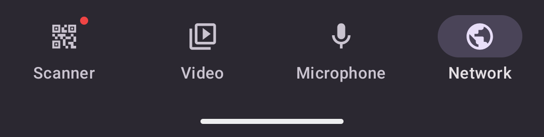
A bottom navigation bar with up to 5 items. Used for your app's primary navigation.
Copied!
<native:bottom-nav label-visibility="labeled"> <native:bottom-nav-item id="home" icon="home" label="Home" url="/home" :active="true" /> <native:bottom-nav-item id="profile" icon="person" label="Profile" url="/profile" badge="3" /></native:bottom-nav>Props#
label-visibility-labeled,selected, orunlabeled(optional, default:labeled)dark- Force dark mode styling (optional)
Children#
A <native:bottom-nav> can contain up to 5 <native:bottom-nav-item> elements.
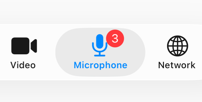
id- Unique identifier (required)icon- A named icon (required)label- Accessibility label (required)url- A URL to navigate to in the web view (required)active- Highlight this item as active (optional, default:false)badge- Badge text/number (optional)news- Show "new" indicator dot (optional, default:false)
badge example#
NativePHP
Bring your
Laravel
skills to the
desktop.

Cloud Platform
Bifrost
Build your NativePHP apps
in the cloud.
Ship it!
Plans from $19/mo
Plugin Dev Kit
Build native plugins with
Claude Code
Learn More
NativePHP Ultra
All NativePHP plugins, teams & priority support from
$35/mo
Learn More

The Vibes
The unofficial Laracon US
Day 3
Grab Your Spot
Only 100 tickets!
The Masterclass
Go from zero to
published app
in no time
in no time
Learn More