You're viewing an older version of this documentation. View the latest version (3.x)
Web View
Every mobile app built with NativePHP centers around a single native web view. The web view allows you to use whichever web technologies you are most comfortable with to build your app's user interface (UI).
You're not limited to any one tool or framework — you can use Livewire, Vue, React, Svelte, HTMX... even jQuery! Whatever you're most comfortable with for building a web UI, you can use to build a mobile app with NativePHP.
The web view is rendered to fill the entire view of your application and is intended to remain visible to your users at all times — except when another full-screen action takes place, such as accessing the camera or an in-app browser.
The Viewport#
Just like a normal browser, the web view has the concept of a viewport which represents the viewable area of the
page. The viewport can be controlled with the viewport meta tag, just as you would in a traditional web application:
<meta name="viewport" content="width=device-width, initial-scale=1">Disable Zoom#
When building mobile apps, you may want to have a little more control over the experience. For example, you may want to disable user-controlled zoom, allowing your app to behave similarly to a traditional native app.
To achieve this, you can set user-scalable=no:
<meta name="viewport" content="width=device-width, initial-scale=1, user-scalable=no">Edge-to-Edge#
To give you the most flexibility in how you design your app's UI, the web view occupies the entire screen, allowing you to render anything anywhere on the display whilst your app is in the foreground using just HTML, CSS and JavaScript.
But you should bear in mind that not all parts of the display are visible to the user. Many devices have camera
notches, rounded corners and curved displays. These areas may still be considered part of the viewport, but they may
be invisible and/or non-interactive.
To account for this in your UI, you should set the viewport-fit=cover option in your viewport meta tag and use the
safe area insets.
Safe Areas#
Safe areas are the sections of the display which are not obscured by either a physical interruption (a rounded corner or camera), or some persistent UI, such as the Home Indicator (a.k.a. the bottom bar) or notch.
Safe areas are calculated for your app by the device at runtime and adjust according to its orientation, allowing your UI to be responsive to the various device configurations with a simple and predictable set of CSS rules.
The fundamental building blocks are a set of four values known as insets. These are injected into your pages as the
following CSS variables:
--inset-top--inset-bottom--inset-left--inset-right
You can apply these insets in whichever way you need to build a usable interface.
There is also a handy nativephp-safe-area CSS class that can be applied to most elements to ensure they sit within
the safe areas of the display.
Say you want a fixed-position header bar like this:
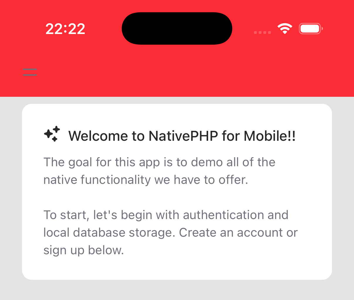
If you're using Tailwind, you might try something like this:
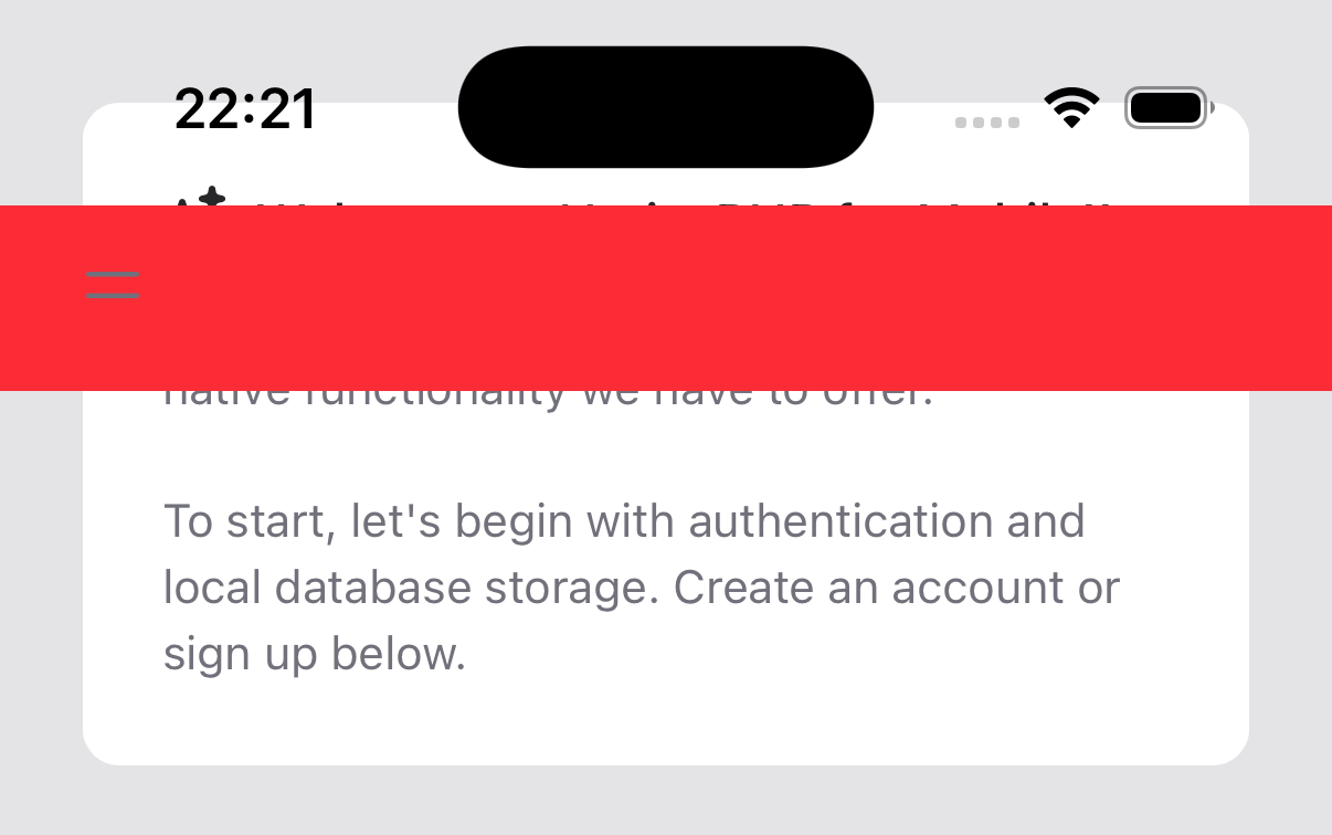
<div class="fixed top-0 left-0 w-full bg-red-500"> ...</div>If you tried to do this without viewport-fit=cover and use of the safe areas, here's what you'd end up with in
portrait view:
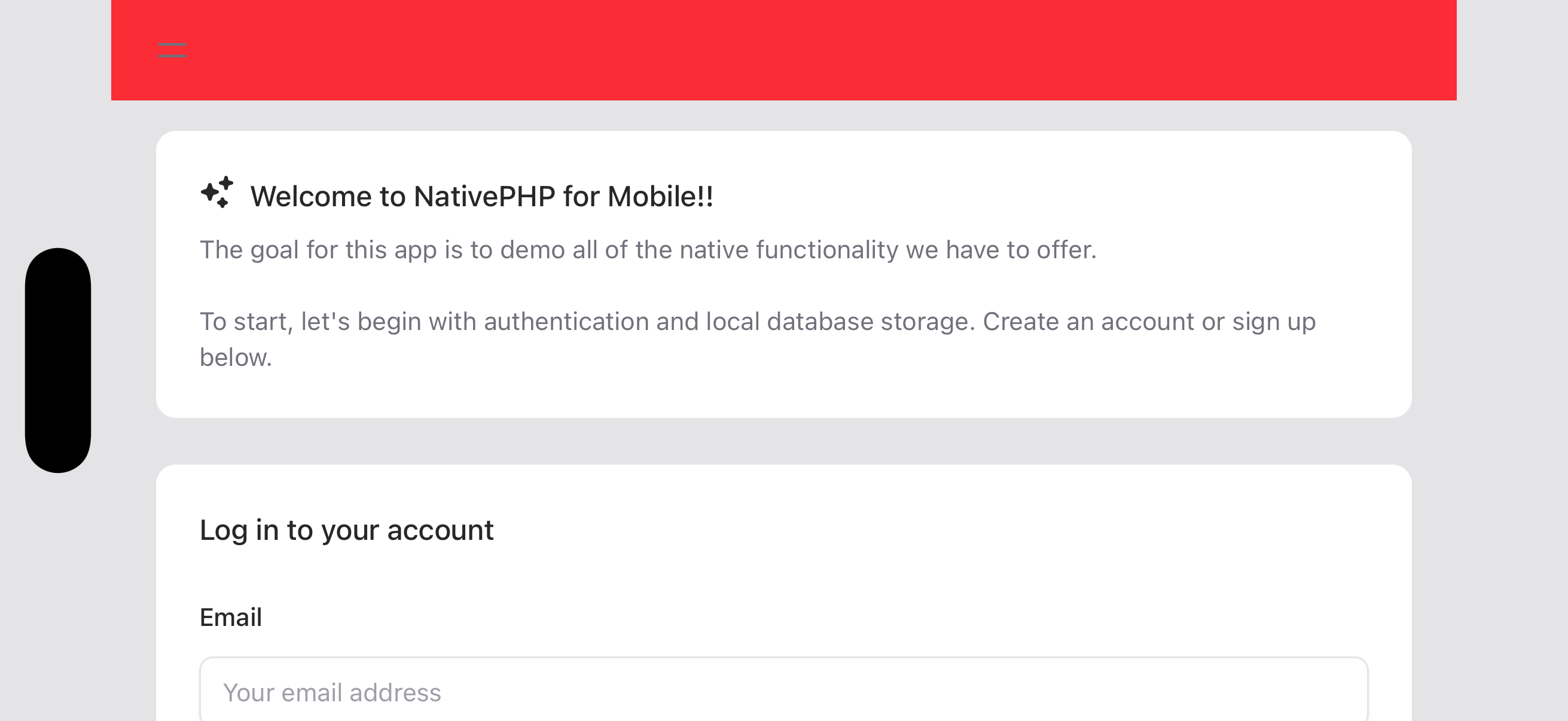
And it may be even worse in landscape view:
But by adding a few simple adjustments to our page, we can make it beautiful again (Well, maybe we should lose the red...):
<body class="nativephp-safe-area"><div class="fixed top-0 left-0 w-full bg-red-500 pl-[var(--inset-left)] pr-[var(--inset-right)]"> ...</div>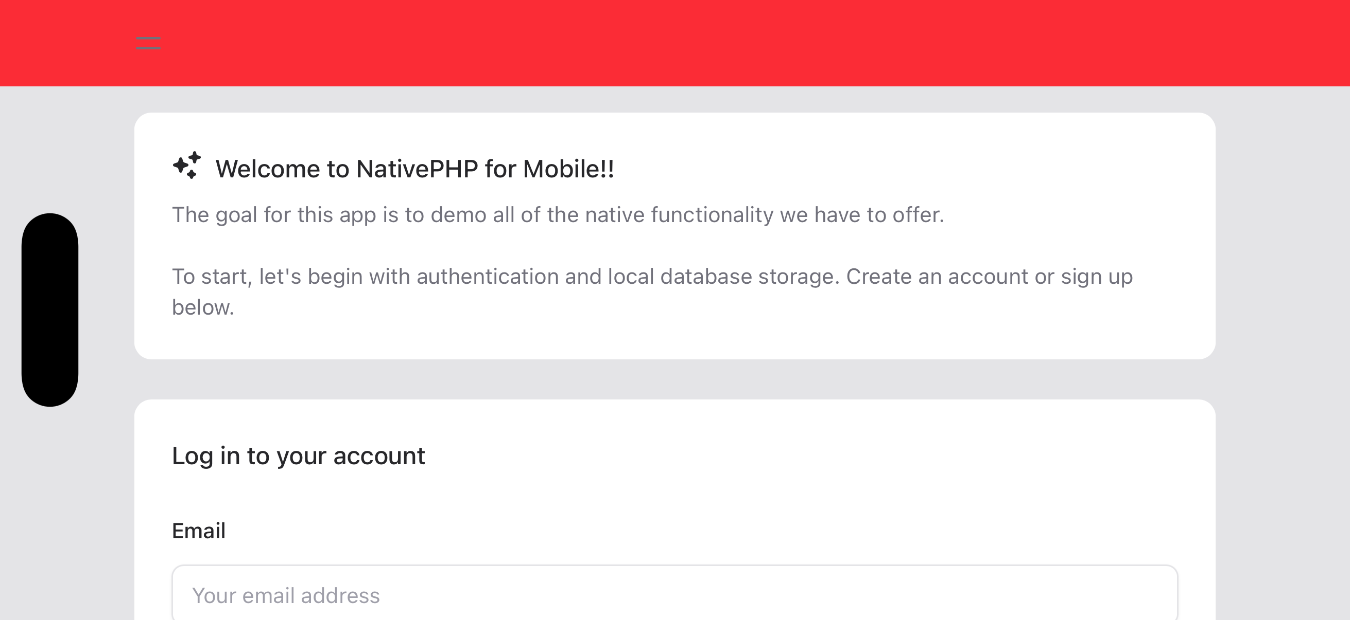
Status Bar Style#
On Android, the icons in the Status Bar do not change color automatically based on the background color in your app. By default, they change based on whether the device is in Light/Dark Mode.
If you have a consistent background color in both light and dark mode, you may use the nativephp.status_bar_style
config key to set the appropriate status bar style for your app to give users the best experience.
The possible options are:
auto- the default, which changes based on the device's Dark Mode settinglight- ideal if your app's background is dark-coloreddark- better if your app's background is light-colored
With just a few small changes, we've been able to define a layout that will work well on a multitude of devices without having to add complex calculations or lots of device-specific CSS rules to our code.

in no time