Native Date Picker for NativePHP#
A truly native calendar date picker for NativePHP Mobile apps. Instead of relying on the OS system dialog (which iOS/Android skins render inconsistently), this plugin draws its own calendar-grid dialog with Jetpack Compose on Android and SwiftUI on iOS — so the picker looks and feels identical on every device, in both light and dark mode.
Tapping the month/year header flips the dialog into a day/month/year wheel picker for fast long-range navigation (e.g. birthdates), then back to the grid.
Features#
- 📅 Custom calendar-grid dialog — no dependency on the stock Android/iOS date picker
- 🎡 Built-in wheel picker for quick year/month jumps
- 🎨 Theming via
accent-color/selected-text-color, falls back to your app's native theme - ♿️ Accessibility labels/hints out of the box
- 🔌 Simple wire format: the value is always an ISO
YYYY-MM-DDstring - 📱 iOS 15+ and Android API 21+
Requirements#
| Version | |
|---|---|
| PHP | ^8.2 |
| nativephp/mobile | * |
| iOS | 15.0+ |
| Android | API 21+ |
Installation#
Since this plugin isn't (yet) published on Packagist, add it as a path repository in your NativePHP app's composer.json:
{ "repositories": [ { "type": "path", "url": "../nativephp-datepicker" } ]}Then require it:
composer require NativeCodeForge/nativephp-datepickerNativePHP requires you to explicitly opt in to every plugin's native code before it's built into your app:
php artisan native:plugin:register NativeCodeForge/nativephp-datepickerRebuild the native projects so the manifest (renderers, min SDK versions, etc.) is picked up:
php artisan native:install --forceQuick start#
<native:date-picker label="Date of birth" placeholder="Select a date" wire:model="dateOfBirth"/>use Livewire\Component; class ProfileForm extends Component{ public string $dateOfBirth = ''; public function save(): void { // $this->dateOfBirth is always an ISO "YYYY-MM-DD" string }}That's it — tapping the field opens the native calendar dialog; the confirmed date is written back to the bound Livewire property as YYYY-MM-DD.
Attributes#
| Attribute | Type | Default | Description |
|---|---|---|---|
value |
string |
— | ISO date (YYYY-MM-DD) to show as selected. Usually set via wire:model instead. |
label |
string |
— | Field label shown above/inside the input. |
placeholder |
string |
— | Placeholder text shown when no date is selected. |
disabled |
bool |
false |
Disables the field. |
title |
string |
"Set date" |
Title shown at the top of the picker dialog. |
cancel-label |
string |
"Cancel" |
Label of the dialog's cancel button. |
confirm-label |
string |
"Done" |
Label of the dialog's confirm button. |
today-label |
string |
— | When set, shows a button that jumps the calendar to today and selects it. |
accent-color |
string |
theme primary | Hex color (#RRGGBB or #AARRGGBB) overriding the accent color for this picker only. |
selected-text-color |
string |
theme onPrimary |
Hex color overriding the selected day's text color — handy when a light accent-color makes the default text hard to read. |
a11y-label |
string |
— | Accessibility label (screen readers). |
a11y-hint |
string |
— | Accessibility hint (screen readers). |
All attributes are also available in camelCase (e.g. cancelLabel, todayLabel) when building elements programmatically.
Events#
Bind wire:model for two-way binding, or listen for changes explicitly with wire:change:
<native:date-picker label="Start date" wire:model="startDate" wire:change="onStartDateChanged($event)"/>The value sent to the handler (and stored in the bound property) is always an ISO YYYY-MM-DD string, regardless of the device's locale or date format settings — so PHP-side parsing (Carbon::createFromFormat('Y-m-d', $value)) stays consistent across platforms.
Programmatic usage#
For advanced cases (e.g. building the element dynamically), use the underlying Element class directly:
use NativeCodeForge\NativePHPDatePicker\Elements\DatePicker; DatePicker::make() ->value('2026-06-25') ->label('Date of birth') ->title('Choose your birthdate') ->todayLabel('Today') ->accentColor('#6C5CE7') ->selectedTextColor('#FFFFFF') ->onChange('onDateOfBirthChanged');Theming#
accent-color overrides the border/label/selected-day background for this picker instance only, without touching your app's global theme. Pair it with selected-text-color when using a light accent so the selected day's text stays readable in both light and dark mode.
Accessibility#
Set a11y-label and a11y-hint to give screen readers a meaningful description of the field and what happens on activation — both map directly to accessibilityLabel/contentDescription and accessibilityHint/stateDescription on iOS/Android respectively.
Screenshots#
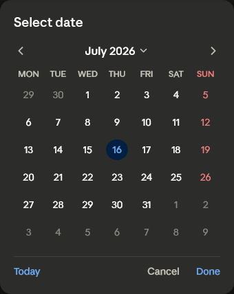
Calendar dialog on Android (Compose). The iOS counterpart (SwiftUI) renders the same layout with the platform's native styling.
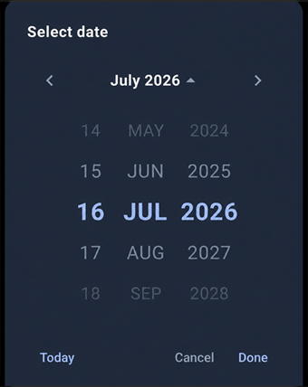
Wheel picker for fast day/month/year navigation, shown here in dark mode.
License#
Proprietary — see LICENSE.md. Licensed via the NativePHP Marketplace.